
Regardless of whether or not I've actually played them, I do have eyes, and I know what I like, so here are some games who's boxart I'm particularly fond of in serious and not so serious ways.
Showing 1-10 of 42 items

This falls into the 'did not play' category, but I can still appreciate it. Definitely get a Watchmen vibe from it, though admittedly, its mostly because of some similarities in the typeface more than the art style or anything. Doesn't hurt that its got a absolutely gorgeous illustration underneath it all.

Steampunk is STILL a underused genre/setting in video games nowadays and Arcanum knew that, even back in 2001. Sure, it suffers from floating head syndrome, but this is remedied by the fact that they are actually steampunk floating heads...thus, a successful boxart!

Another one before my time, but boy do I love me some 'painted' box art (and also Star Trek). Sure, it's a bit off kilter composition-wise (e.g. why is their a phaser coming out of those dudes at the bottom?), but how can you not love the colors, it just says, "Yeah I was made in 1987, what of it?"

Speaking of colors....glorious. It doesn't have one thing to do with the game (except for the colors of course), but I don't think I could think of a better way to market the game. :P

Roger Dean is the man to thank for this, and while he is better known for this work with album covers his styles lend itself quite well to some truly great looking box art. And yes, I looked him up, so sue me.

Simple, effective, love it. While I believe that the boxart we have here on GB is the more modern version, the original was not too different if I recall, so booyah.
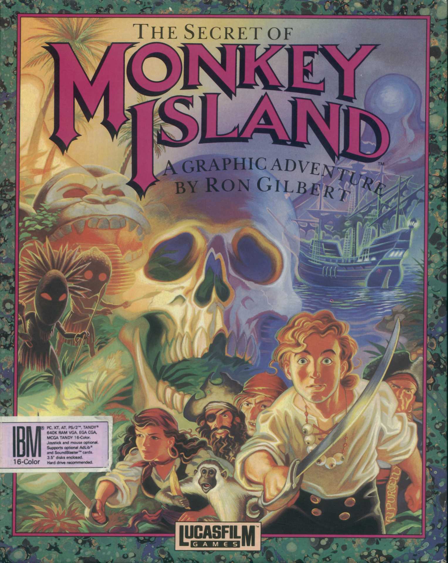
Again, painted box arts, especially those created by LucasArts, always a favorite. As much as I enjoy the Special Edition remake it really did change the style of the game quite significantly, and the new version of this box art isn't nearly as enjoyable.

It's just a really visually pleasing boxart, for a really visually pleasing game. Appropriate I guess. The outlined type just works here so well.

Winner of the most straight forward boxart goes to.....Age of Empires! Not that I'm knocking it of course, its absolutely gorgeous, but it pretty much tells you what's up the moment you look at it. A bunch of ancient civilizations duking it out? Got it.

You would think the F-22 front and center on the box would be enough to persuade any red-blooded American/person to pick up this flight-sim gem, but no, they go and add lightning bolts against a blood red sky to seal the deal. Obviously a less serious pick, but hey, can you blame me?