
Good box art is something that's really unappreciated, even in this age of people debating about the artistic value of video games. At their best, they not only tell you at a glance what a game is about, but what makes it special and why it should matter to you, justifying why you should pay attention to it instead of all the other games on that store shelf. Good box art doesn't always lead to you actually finding a good game inside the box, but at the very least, they hint at the potential that's inside it. This list is here to celebrate those boxes.
It should be noted that due to regional discrepancies in box art for a lot of video games, more often than not I'll specify which version I'm referring to and why it's so rad. Otherwise it'd be giving some games' box art way more credit than they deserve.
Showing 1-10 of 15 items

The Japanese and European box art for Ico really does justice to the underlying premise of the game. You and a girl are trying to make your way through a world neither of you really understands, but still has to overcome. The companionship each has to offer to the other is what drives them to reach the end. Most importantly, at least on a superficial level, beautiful and striking, yet simplistic environments and vistas await throughout the adventure. It's a piece of box art that allows you to intuitively understand the game's premise without reading a single word on the back while still being enjoyable to look at in its own right.

I actually bought a Japanese copy of the game on impulse years ago simply because I liked the aesthetics, despite having no Saturn. While the cover doesn't really convey much in the way of what the game is about, the use of markers in its coloring makes it stand out. Usually such things are associated with kiddy art projects, but here, they give the artwork a tangible and handmade sort of feel. It doesn't look professional, but that's also probably the point. It's unrefined, yet nevertheless pleasing to gaze at.

I love the Japanese box art to no end. Very clearly, you see the protagonist dealing with the ever-imposing Thanatos as it virtually rips itself out of his body. Why such a thing is happening is anybody's guess for those who haven't played the game, but it clearly evokes the game's themes of struggling with one's humanity and the facades used to cope or overcome them. It's not a very marketable boxart for other markets, but that doesn't make me want to turn into a gigantic poster any less.

There's an ongoing theme of Japanese box art, if you haven't noticed, and that trend continues with Trauma Team. In Japan, the game's title actually doesn't openly reference the previous games in the series at all, instead going for something to the effect of, "Hospital: The Six Doctors." Bland though it may be, the artwork that accompanies it encompasses that title quite well. You see all of the cast in their element and, as if to emphasize the deliberately disjointed narrative the game purposefully employs, it's a collage of images, rather than one cohesive piece like so many other games use. It's a game that covers a lot of different ground both in the gameplay and in the plot and the Japanese box art gets that point across effectively.

Seriously, Riot Act is just the superior name for that series.

Captain Rainbow's box art isn't amazing so much for the artwork as it is that mob of text it's got going on the right half. Although it requires some Japanese fluency, essentially it says, "This isn't one of those video games that's about some cool hero. Flip over to the back and read on for more details." You therefore don't even have to take out the disc from inside the case to begin experiencing the game's highly meta nature.

The Famicom version's box art for Door Door is just all around charming. It's got a clean papercraft sort of aesthetic that works well with the game's simplistic mechanics and compliments the character designs well. Really, it's just an interesting bit of artwork to look at, especially since it looks like it was just a little diorama that was photographed.

There might not be a whole lot to the box itself, but the color scheme and spartan presentation kind of remind me of what you might find out of a Criterion Collections design. The whole thing kind of just looks like a cover you'd find for a 1960s movie and that sort of style is a plus in my book.

I get a real Ikaruga sort of vibe on the Japanese box from the almost exclusive use of black, white, and gray as the box art's color palette. It's unassuming, with no real action or anything dynamic happening, yet still interesting to look at, what with the ship designs and (inexplicable?) presence of feathers. The font, too, is interesting, as it eats up way more real estate on the cover than is typical, making it distinct in that regard.
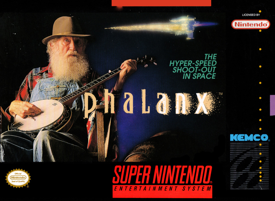
Because what?