Post-Redesign Development & Design Priorities

Avatar image for wemmick
wemmick

138

Forum Posts

48

Wiki Points

0

Followers

Reviews: 0

User Lists: 2

#1  Edited By wemmick

We understand that there are several outstanding issues with the site from the latest redesign, and we'd like to help y'all track what we're doing so you know what to expect. In this thread, I'll be maintaining a list of problems we recognize and that we are (or will be) working on solutions for, and we'll let you know when fixes are released. Feel free to post any other issues you see in this thread, and I'll keep the list updated as we go.

Please be aware there are other projects in our queue as well, such as minor bugs, projects we aren't ready to talk about, or fixes in the CMS to help with content publishing.

That all said, here are the major issues we'll be tackling, sorted roughly in order of importance, but not necessarily in order of release:

-- UPDATED MAY 23, 2019 --

Homepage

  • Topslot design/size
  • Integrating decks (episode descriptions)
  • Carousel typography
  • Carousel Next/Prev buttons

Episode page

  • Player design
  • Credits missing
  • Link to wiki page missing
  • "Filed under" links
  • In More Episodes, show nearest episodes by default, regardless of year/season
  • More episodes sorted latest first, added option to change sort order
  • NEW: Embiggen replacement

Nav

  • Drawer animations
  • Better large-monitor support
  • Easier access to Premium videos, Shows
  • Add link to list of Latest Premium Videos

Typography

  • General forum/article typography/readability (partially done)
  • Link/quote/bulleted list styles (partially done)

Wiki

  • Display name of show with the episode name
Avatar image for pickassoreborn
pickassoreborn

767

Forum Posts

2319

Wiki Points

0

Followers

Reviews: 5

User Lists: 6

No Caption Provided

Any chance you could consider rolling the GB Infinite info into that GB Infinite panel? It'll make the whole thing more contextual and also means you'll be able to push the content up a bit more.

Avatar image for wemmick
wemmick

138

Forum Posts

48

Wiki Points

0

Followers

Reviews: 0

User Lists: 2

@pickassoreborn: The upper left image is a temporary promo, so it won't live there (looking redundant) for long.

Avatar image for swordstruck
swordstruck

124

Forum Posts

0

Wiki Points

0

Followers

Reviews: 0

User Lists: 0

On mobile the expanded sidebar menu doesn't scroll, so if I expand the 'Forums' nav I can't select anything lower than 'Bombcast'. Obviously this is going to be different depending on mobile resolution, I'm using an iPhone 8. Regardless of phone screen size, the menu should scroll if it overflows.

Avatar image for silenceuk
SilenceUK

386

Forum Posts

7

Wiki Points

0

Followers

Reviews: 0

User Lists: 1

My biggest issue with the new site is to do with downloading videos.

A good amount of the time when I load a tab with the latest quick look etc the video starts to play and remove the download option faster than I can click download right click hd save target as.

What can be done to stop this ?

Avatar image for thesped44
thesped44

7

Forum Posts

0

Wiki Points

0

Followers

Reviews: 0

User Lists: 0

This might be what "integrated decks" refers to, not sure.

Just in case, when I Google "Giant Beastcast" the top result is the latest episode but it sends me to the older format where you play the audio through that cassette tape player.

That player doesn't work. Clicking play does nothing. Tried on both Firefox and Chrome.

Small issue because if you go to the front page or through podcasts page it gives new player and works fine, but thought I'd point it out.

Avatar image for wemmick
wemmick

138

Forum Posts

48

Wiki Points

0

Followers

Reviews: 0

User Lists: 2

@swordstruck: Yep, we have a ticket in for this - sorry, it's a smaller one, so I didn't call it out in the list.

@silenceuk: The new episode page will address this.

@thesped44: Good catch! Those pages should be redirecting to the new Show pages - we'll get that fixed.

Avatar image for rebel_scum
Rebel_Scum

1633

Forum Posts

1

Wiki Points

0

Followers

Reviews: 1

User Lists: 3

#10  Edited By Rebel_Scum

Damn, would've thought a light theme would've been high considering the number of complaints about the lack thereof. No worries. Keep up the good work, thanks for the update.

Avatar image for therealturk
TheRealTurk

1412

Forum Posts

0

Wiki Points

0

Followers

Reviews: 0

User Lists: 0

Another potential bug report: When you add items as a bulleted list, they don't actually show up as bullets when you make the post:

No Caption Provided
No Caption Provided

Avatar image for processr
processr

211

Forum Posts

4

Wiki Points

0

Followers

Reviews: 0

User Lists: 1

Damn, would've thought a light theme would've been high considering the number of complaints about the lack thereof. No worries. Keep up the good work, thanks for the update.

They've consistently said a light theme isn't under consideration.

I've noticed some slight weirdness when scrolling on a video page. The video looks normal when I'm at the top of the page, but once I scroll the video gets brighter, like it's been overlaid with a white colour at low opacity. It's difficult to explain, and also it doesn't show up when I take screenshots somehow? Very weird. This is on Chrome on Chrome OS 72. I wasn't able to reproduce the behaviour on Firefox 64 or Chrome 71 on Win10, but on there the video looks like the lighter version of the two, so maybe it's actually a case of the video panel being darkened on Chrome OS? That's such a niche case so I can't see it landing on anyone's sprint any time soon, but thought I'd let y'all know anyway.

Avatar image for brainscratch
BrainScratch

2077

Forum Posts

0

Wiki Points

0

Followers

Reviews: 0

User Lists: 0

@processr said:
@rebel_scum said:

Damn, would've thought a light theme would've been high considering the number of complaints about the lack thereof. No worries. Keep up the good work, thanks for the update.

They've consistently said a light theme isn't under consideration.

I know they've said a light theme isn't under consideration but there's so many people with problems reading the text on the website on it's current state that it gets to a point that it's more of a usability issue than just an aesthetic/personal preference issue. Even if they don't want to do a light theme, I think they should at least fix the dark theme to make it readable for the large number of users who are having issues with it. Specially when there has been user feedback that accurately pinpoints the exact problem people have and suggests simple fixes to improve it.

Avatar image for themanwithnoplan
TheManWithNoPlan

7843

Forum Posts

103

Wiki Points

0

Followers

Reviews: 1

User Lists: 14

I just want to point out that the same issues with readability on the forums exist for the wiki and any written article too. Mainly the bright white text. (which has been the central problem for me, as I've expressed in the previous thread)
In image 2, 3 and 4 you can see that the white text is all the same. Including the header text in image 1. The only difference here being the slightly darker box for the forums. Regardless, against any color this text is harsh to look at when there's more than a couple sentences. I thought I'd also include a comparison to something that's infinitely more accessible: the description for image 1 is a perfect example of text on the site being perfectly readable. I hope these other parts of the site are being considered for readability options. I've only seen @wemmick mention this in respect to the forums so far. Once again, I just want to express my thanks to the dev team for listening and working hard on remedying some of the concerns of the community. Keep it up ya'll!

No Caption Provided

Avatar image for theadmin
TheAdmin

1062

Forum Posts

6686

Wiki Points

0

Followers

Reviews: 5

User Lists: 8

#15  Edited By TheAdmin

Here's a list of questions I'd love @danauer and the design team to answer, broken into category (suggestions in italics):

Navigation:

  • Why did "forums" and "wiki" not get the same treatment as "Words" in the top nav?
    • Why was the "wiki" drawer split into 3 groups? (new releases, games, franchises, characters being the first group)
    • It would be a lot more consistent and you could feature new additions and what's popular in the forums.
  • Why not make the nav menus open on click instead of hover?
    • This would remove the issue of clipping the menu item to the left and having it close on you.
  • Why is the search all the way to the right and kind of hidden?
    • Why is the search filter, when the search is shown, all the way to left?
  • Why if all the menu items have a menu drawer are there carets next to the words?

Homepage:

  • Why was all content, except for videos and tweets, removed from the homepage? Why not include new forum posts, new additions to the wiki, new games coming out?
  • Why does the hero have the show name as the biggest title and the name of the video the subtitle? (QUICK LOOKS, Dota auto chess) Shouldn't it be the other way around?
  • Why do carousel arrows have such a subtle difference to whether it's active or not?
  • Why do carousels have latest items to the left on the homepage, but episode pages they go the opposite?
  • Why does the "live on GB Infinite" bar not follow any other design pattern?
    • It doesn't look like it's something you can click on
  • Why do carousel item containers not visually show they're the same height as the arrows and "Show more" boxes?
    • I understand this is subjective, but I think it would be more visually appealing if the arrows / show more stopped at the bottom of the thumbnail, since the text below floats.

Latest / Shows List (Videos)

  • Why can't I filter, sort, or search the latest videos page or shows page?
    • The homepage concept serves better as the default videos page, with "latest" and "shows" as two pages from there. The user gets the best of everything, categorized carousels, latest grid, latest show grid.
  • Why does the shows page not show which ones have been updated or have new episodes?
  • What order is the latest / shows page suppose to be in? (alphabetical, most recent, recently updated?)
  • How do I find uncategorized shows? (For example "The 'There's no new games' Show" video).

Episode List

  • Why is there no episode list page?
    • After clicking a show, you go directly to an episode instead of a listing of all episodes and years (which act as seasons) for the show. Netflix, HBO, Hulu, YouTube (playlists) all have episode list pages. The old videos page acted as this page since you were able to filter by show/type.

Episode (video player)

  • Why is all the video info (title, date, etc) hidden once the video plays?
  • Why are related videos categorized here by year?
    • This seems like an arbitrary step for me to have to switch between, as some years have only one or two videos (Breaking Brad for example). It would be better to just let users scroll through all.
  • Why does switching to grid view or carousel view not stay as a preference as I browse to other episode pages?
  • Why does the grid view not show the timestamp and the carousel view not show the comment count?
  • Why does the player, player container, carousel / grid container, and comments container all have different widths?
  • Why are related videos newest to the right when the homepage (and most common video sites) has newest to the left?
  • Why was pinning the player (lock it so you can scroll comments) removed?

Forums

  • Why when added sub-bullets does it add a space under it after publishing?
Avatar image for brainscratch
BrainScratch

2077

Forum Posts

0

Wiki Points

0

Followers

Reviews: 0

User Lists: 0

@theadmin said:

  • Why not make the nav menus open on click instead of hover?

Because the title of the menus are also links to different pages. Also hovering is much more practical than clicking once to open the menu and then click again if you want to go to a sub menu. The hovering system is fine, what they need to fix is how it navigates and animates.

Other than that, I think you made great questions and bring up various inconsistencies on this new design that I've also been curious about and would love to either get an answer or a fix to them.

Avatar image for wemmick
wemmick

138

Forum Posts

48

Wiki Points

0

Followers

Reviews: 0

User Lists: 2

@therealturk: Indeed, I added that to the list.

@themanwithnoplan: Yep, the readability issues do go beyond the forums - I'll update the issue list to reflect that.

Avatar image for wemmick
wemmick

138

Forum Posts

48

Wiki Points

0

Followers

Reviews: 0

User Lists: 2

@theadmin You have some good questions in here, so I'll try to give some insight. There's a LOT of stuff here, so I'll try to respond to as much as I can, but I may not be able to keep responding to this thread much beyond this - I gotta get some other work done, too. : ) My responses in bold.

Navigation:

  • Why did "forums" and "wiki" not get the same treatment as "Words" in the top nav? - Forums and wiki are user-contributed content, so it's fairly natural that they get a different presentation. Also, especially in the case of forums, we wanted to make sure people still had quick access to the most popular forums rather than forcing a click to get to the Forums page before they can pick a forum.
    • Why was the "wiki" drawer split into 3 groups? (new releases, games, franchises, characters being the first group) - 3 columns fit the number of links well. I'm not sure I understand what you're getting at here.
    • It would be a lot more consistent and you could feature new additions and what's popular in the forums. If we did this in a large presentation like the other nav options, you'd lose the quick links to popular forums. If anything, we're leaning towards a more link-dense presentation for Videos and Podcasts going forward.
  • Why not make the nav menus open on click instead of hover?
    • This would remove the issue of clipping the menu item to the left and having it close on you. The nav menus are clickable themselves, so that precludes a click-to-open model.
  • Why is the search all the way to the right and kind of hidden? It's a fairly common model online to keep the search in the top right.
    • Why is the search filter, when the search is shown, all the way to left? I suppose it could be on the right, but if you consider it's a filter that takes precendence to the search, putting it on the left isn't too crazy. I'm not sure either side is particularly more usable.
  • Why if all the menu items have a menu drawer are there carets next to the words? We've been discussing the needs for these internally and haven't come to a final conclusion. The original intent was to show that they have drop-down menus - without the arrows, it isn't obvious that they have dropdowns, and you won't know they have dropdowns until you hover. That said, they do add a touch of clutter to the nav, and they dropdowns will probably be discovered regardless.

Homepage:

    • Why was all content, except for videos and tweets, removed from the homepage? Why not include new forum posts, new additions to the wiki, new games coming out? It was decided that the homepage should have a strong focus on editorial content - videos, podcasts, and articles. We wanted the nav to continue to give people quick access to the Forums and Wiki - folks who are interested in wiki and forums from the homepage will find them regardless (tends to be a very small percentage of users.) The wiki will get a more proper homepage of its own sometime this year.
    • Why does the hero have the show name as the biggest title and the name of the video the subtitle? (QUICK LOOKS, Dota auto chess) Shouldn't it be the other way around? Also a good debate to be had here. There are arguments that show names may be more recognizable in some instances. Show names have always preceded episode names on GB, but that said, it's not currently consistent with the carousel presentation.
    • Why do carousel arrows have such a subtle difference to whether it's active or not? We don't want the arrows drawing too much attention. The difference also may look more or less pronounced on different monitors with different brightness and contrast settings.
    • Why do carousels have latest items to the left on the homepage, but episode pages they go the opposite? Here's the concept: on the homepage, you're here to see the latest stuff, so right-to-left makes sense. On the episode page, at least for some shows, you're more likely to be watching them chronologically, so left-to-right makes sense. That said, the expected behavior kind of depends on the other sites you use - different sites do it different ways. We will be introducing a switch so folks can sort how they like. Why does the "live on GB Infinite" bar not follow any other design pattern?

    • It doesn't look like it's something you can click on It was designed late in the process. It's in the middle of a redesign.
    Why do carousel item containers not visually show they're the same height as the arrows and "Show more" boxes?
    • I understand this is subjective, but I think it would be more visually appealing if the arrows / show more stopped at the bottom of the thumbnail, since the text below floats. Also a subject of internal debate. We have a new style in the works that will resolve this.

Latest / Shows List (Videos)

  • Why can't I filter, sort, or search the latest videos page or shows page? Well, it's the Latest videos, so the sort is kind of build in. I'm not sure what kind of filter you'd want here. A search would do the same thing as the main search. Interesting concept with bringing carousels to that page - we'll think on that.
    • The homepage concept serves better as the default videos page, with "latest" and "shows" as two pages from there. The user gets the best of everything, categorized carousels, latest grid, latest show grid.
  • Why does the shows page not show which ones have been updated or have new episodes? That would be a nice addition.
  • What order is the latest / shows page suppose to be in? (alphabetical, most recent, recently updated?) Aside from the top two promo slots, the Shows page is alphabetical.
  • How do I find uncategorized shows? (For example "The 'There's no new games' Show" video). You're pretty much stuck with Search. We discussed a "miscellaneous" show, but that doesn't really solve the problem as it becomes a big pile of random stuff.

Episode List

  • Why is there no episode list page?
    • After clicking a show, you go directly to an episode instead of a listing of all episodes and years (which act as seasons) for the show. Netflix, HBO, Hulu, YouTube (playlists) all have episode list pages. The old videos page acted as this page since you were able to filter by show/type. You can see more episodesdirectly there on the Episode page, so we didn't think an additional page was necessary. Switching to grid view allows you to see more without scrolling through the carousel, if that helps.

Episode (video player)

  • Why is all the video info (title, date, etc) hidden once the video plays? To allow focus on the video itself. It's a fairly common pattern in OTT/mobile apps, but admittedly it may not be necessary on desktop. We are looking at options here currently.
  • Why are related videos categorized here by year?
    • This seems like an arbitrary step for me to have to switch between, as some years have only one or two videos (Breaking Brad for example). It would be better to just let users scroll through all. Breaking Brad is a bit of an edge case. That grouping was done to accommodate more common/popular shows like QLs, UPF, Beastcast, Bombcast that all have lots of eps per year.
  • Why does switching to grid view or carousel view not stay as a preference as I browse to other episode pages? We may change this.
  • Why does the grid view not show the timestamp and the carousel view not show the comment count? We're working on making all of that more consistent.
  • Why does the player, player container, carousel / grid container, and comments container all have different widths? Various reasons...but some of this will be resolved soon.
  • Why are related videos newest to the right when the homepage (and most common video sites) has newest to the left? Not sure what this is referring to.
  • Why was pinning the player (lock it so you can scroll comments) removed? The video player is currently too big on most monitors to allow much real estate for seeing the text as you scroll.

Forums

  • Why when added sub-bullets does it add a space under it after publishing? Dunno. Probably some quirk of TinyMCE.

Avatar image for processr
processr

211

Forum Posts

4

Wiki Points

0

Followers

Reviews: 0

User Lists: 1

Current upcoming list shows "Mass Alex: Part 01" - most of us will know that refers to Season 2 Part 01, but it was still a little jarring to see simply "Part 01". "Mass Alex: Mass Effect 2: Part 01" is hardly an appealing solution; perhaps the season name could take the place of the video type ("Episode", "Premium Live Show" etc.) like so:

No Caption Provided

I've shifted "Episode" to the right in a slapdash way, but maybe you don't even include it for a show like Mass Alex with named seasons, since it's not not going to be an episode, if you see what I mean.

Avatar image for styx971
styx971

710

Forum Posts

10

Wiki Points

0

Followers

Reviews: 0

User Lists: 1

#20  Edited By styx971

i agree with processr above about the upcoming , i hoped on the main page and honestly did a double take even knowing me2 stuff was oming due to the way it looks and anyone new wouldn't know better.

thanks wemmick for the update on things it was very nice to know whats actually appears to be in the pipeline even if they don't happen too quickly , ... on the topic tho of things like why is x like y .... why if your in grid view for say quick looks for example in posted order vs latest order on those i can understand on say steal my sunshine it would be 1st to last but something like a quick look i would assume most ppl would rather have newest to oldest, i mentioned it months ago on the previous thread and never really got a reply about that and while its easier now to see the difference with the yr being new i just thought there was nothing new for a week or so when the redesign was fresh cause it was presented that way when i switched to grid view and even then the newest was really on another page ( even more unexpected). this may have been mentioned in the last update/post with the replies to the bullets but the phrasing was a bit awkward on a few of those so sorry if i'm just missing that.

also not every show needs a yr , its a good idea in concept but like others said some shows only have a couple things in 1 yr vs another ( again steal my sunshine is a good example since 2018 only has the last 2). i don't like when extra work is added on to things in my life either when it comes to work but something sorting out 1 show vs another for that type of thing would be great honestly cause its just odd, maybe have an inter do it or something if need be? ( i don't wanna sound jerky to interns its just the experience i've had in manufacturing the intern gets the shaft with projects like that)

Anyway ty again for this update i'm sure i'll thing of more things in the future that irk me and i mention it but after this long it was really nice to see something like this even if it should have in many ppls eyes came sooner.

Avatar image for wemmick
wemmick

138

Forum Posts

48

Wiki Points

0

Followers

Reviews: 0

User Lists: 2

@styx971: Date sorting options are on their way - stay tuned!

As for some shows not needing season/year separators, I'll chat with Jeff about it. We separated them out by year across the board, and in some instances like GOTY it still makes sense, even without a ton of content, but...there are always edge cases.

This site is chock full of edge cases, btw, which is what makes so many of these decisions difficult and frankly makes a lot of of this development take longer than it should. Things like the episode page redesign are hard because there can be 4 versions of an episode - video, podcast, free, premium, and there can be any combination of those four. Or a YouTube version. Show title already in the episode title or not. Show notes or not. Wiki links or not. Part of a show or not. Part of a serial show or an episodic show. Part of a show that publishes weekly or one that publishes a couple of times/year. The user is signed out/signed in/premium/moderator/staff. That's a whole lot of IF statements. : ) Anyways, not complaining, but just explaining why some of these edge cases haven't gotten the attention they need yet.

Avatar image for bas_l
Bas_L

34

Forum Posts

20

Wiki Points

0

Followers

Reviews: 0

User Lists: 3

@wemmick said:

As for some shows not needing season/year separators, I'll chat with Jeff about it. We separated them out by year across the board, and in some instances like GOTY it still makes sense, even without a ton of content, but...there are always edge cases.

Another side effect of filtering by default on the current year, is that it has made the site look way more empty while we are at the start of the year.

Avatar image for humanity
Humanity

21858

Forum Posts

5738

Wiki Points

0

Followers

Reviews: 40

User Lists: 16

Small thing I noticed recently:

Spoiler tags don't work in the Notification page. If someone replied to you with spoiler tags and you go to the Notifications summary you'll see all the text.

Avatar image for styx971
styx971

710

Forum Posts

10

Wiki Points

0

Followers

Reviews: 0

User Lists: 1

#24  Edited By styx971

@wemmick: good to hear thats something being worked on . yeah i get that could be a hassle overall it just seemed like more of a flaw in design for some things over others , e3 and goty stuff i think highlight why its great in concept and even execution for those but not everything. either way thanks for the update/reply ^^

Avatar image for wemmick
wemmick

138

Forum Posts

48

Wiki Points

0

Followers

Reviews: 0

User Lists: 2

@bas_l: Yep, that bugged me, too. Fortunately, we have 11 months to think about it...

Avatar image for therealturk
TheRealTurk

1412

Forum Posts

0

Wiki Points

0

Followers

Reviews: 0

User Lists: 0

@wemmick said:

@styx971: . . .

Things like the episode page redesign are hard because there can be 4 versions of an episode - video, podcast, free, premium, and there can be any combination of those four.

. . .

Because this appears to be an organizational challenge as much as a technical one, might I offer a suggestion on this point? It seems like the hangup is mostly a challenge with Videos and Podcasts, as those are the most likely to have different versions according to whether someone is Premium or Non-Premium user (I could be wrong, but I can't think of any Forum, Wiki, or Community content that is excluded from non-premium memberships).

It might therefore be easier/better to replace "Videos" and "Podcasts" on the upper nav bar with "Premium" and "Non-Premium" and then have Videos and Podcasts live as subdivisions within those two categories. This would allow users to immediately get to the version of content that is applicable to them while also letting non-premium members see the content available to them without needing to click into something to see that it is Premium-only.

While this would probably mean slightly larger menus/more clicks, I think the benefits outweigh the costs in this instance. The division between Premium and Non-Premium functions as something of an initial condition in terms of setting what content a user even has access to, so from an organizational perspective, it makes sense to have that be the first distinction a user encounters, rather than the specific content-type (video/podcast/etc.) itself.

Avatar image for theadmin
TheAdmin

1062

Forum Posts

6686

Wiki Points

0

Followers

Reviews: 5

User Lists: 8

#27  Edited By TheAdmin

Giant Bomb does not make shows; they make videos, podcasts, and articles about topics that may or may not be sequential or related. Sorting by year is irrelevant. Some good examples to show Jeff:

  • Quick looks - you watch the ones you're interested in, year doesn't matter, especially if you came to the game late.
  • Unfinished - same as quick looks
  • Steal my sunshine - Has a beginning and end, someone could watch the entire thing.
  • Star spangled Beasters - Got cancelled, only a couple of episodes.
  • Jeff Gerstmann's Tony Hawk's Pro Skater - 3 total episodes, only 2 in 2018 (months apart), one this year so far.
  • The "There's no new games" Show - One off episode that will be lost to time since there's no way to find it later.

Honestly, I think you should have called them Playlists over Shows. Shows has a very specific meaning and GB just doesn't make "shows" in the traditional sense. Now let's think about playlists, which can include:

  • Videos in a series (Steal my sunshine, Die another Friday),
  • Videos related by content type (Quick Looks, Unfinished)
  • Videos & Podcasts by a topic (Game of the year, E3)
  • Videos & Podcasts by membership (Premium Subscribers)
  • Podcasts (Giant Bombcast)
  • Videos, Podcasts, and Articles (Game of the year)
  • Articles (GOTY top 10 lists)

By going with Playlist, instead of show, it would be way more flexible on what type of content it included. You could still subscribe to a playlist (add to watchlist feature), share playlists, create your own playlists (GOTY top 10 community).

Avatar image for theadmin
TheAdmin

1062

Forum Posts

6686

Wiki Points

0

Followers

Reviews: 5

User Lists: 8

#28  Edited By TheAdmin

@wemmick you had said: "Well, it's the Latest videos, so the sort is kind of build in. I'm not sure what kind of filter you'd want here. A search would do the same thing as the main search. Interesting concept with bringing carousels to that page - we'll think on that."

You're correct, it's already sorted by latest, but let me also filter by type or show (quick look, premium, etc). Don't make me go to the shows page, click on quick looks, go to the episode page and then hunt through the carousel. Just let me filter right there on the latest page - convenient and easy.

Search should just instantly show/hide the current view to what I'm typing - instant local search of the latest page. So if I type "die another friday", it shows just die another friday videos sorted by latest (most recent top left).

Avatar image for wemmick
wemmick

138

Forum Posts

48

Wiki Points

0

Followers

Reviews: 0

User Lists: 2

@theadmin: I like where you're going with that. After we get past some of the more pressing issues, I'll see what we can do here.

Avatar image for avantegardener
avantegardener

2491

Forum Posts

165

Wiki Points

0

Followers

Reviews: 0

User Lists: 11

Great to see these issues being addressed, thanks for the hard work, although I'd probably not recommend live A/B testing, got some good feedback from the community.

Avatar image for deactivated-6321b685abb02
deactivated-6321b685abb02

1057

Forum Posts

0

Wiki Points

0

Followers

Reviews: 0

User Lists: 0

Thanks for the hard work and continuing transparency, seems to address a lot of the main issues folk seem to have. I look forward to seeing it roll out.

Avatar image for kerned
Kerned

1246

Forum Posts

2517

Wiki Points

0

Followers

Reviews: 0

User Lists: 2

I don't listen to the Bombcast anymore, I only watch it. Right now there is no convenient way to know when the video version of the Bombcast is available. When the podcast goes up it appears in the topslot with a "WATCH NOW" button, but when you click it there is nothing to watch, only the audio podcast. I would suggest that such a button should never be used to direct the user to audio.

The only way to know when the video Bombcast is available is to constantly refresh the podcast page and wait for the toggle to become active. This is not a great experience. Adding the Bombcast to my watchlist doesn't help either, since no distinction is made between the audio and video version.

Since it is a hugely popular show, and people will doubtlessly want to watch/listen to it in the format they prefer, shouldn't the Bombcast really be separated into two feeds? If this runs counter to a key philosophy of the redesign, I would ask that you consider developing a easy method for users to know when each version is available.

Avatar image for styx971
styx971

710

Forum Posts

10

Wiki Points

0

Followers

Reviews: 0

User Lists: 1

i'm all for premium/ non-premium tabs , the old design had a section in videos for premium and the podcasts had 2 options for it also , my assumption tho was they were trying to get rid of that with this design tho. i haven't had any issues with differentiating the 2 versions at all , my podcast always defaults to premium normally on the video option and i usually just swap it to audio and listen to it while playing a time killing type game.

Avatar image for brainscratch
BrainScratch

2077

Forum Posts

0

Wiki Points

0

Followers

Reviews: 0

User Lists: 0

No Caption Provided

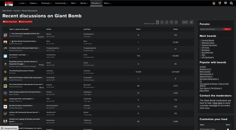
Is this a bug or the new design for the forums?

It really doesn't make sense to give the same width to all columns when the density of information is different for each one. I hope it's just a bug!

I'm running it on Safari 12.0, MacOS 10.14

Avatar image for wemmick
wemmick

138

Forum Posts

48

Wiki Points

0

Followers

Reviews: 0

User Lists: 2

Avatar image for nick
Nick

1153

Forum Posts

13

Wiki Points

0

Followers

Reviews: 0

User Lists: 3

is there any chance of adding the option for shows and latest episodes to be in a list format instead of a grid? i find lists easier to navigate.

Avatar image for wemmick
wemmick

138

Forum Posts

48

Wiki Points

0

Followers

Reviews: 0

User Lists: 2

Avatar image for nick
Nick

1153

Forum Posts

13

Wiki Points

0

Followers

Reviews: 0

User Lists: 3

@wemmick

the following pages are grid view only:
Videos -> Latest
Videos -> Shows
Podcasts -> Latest
Podcasts -> Shows

an example of a page that is carousel or grid view:
Videos -> Shows -> Unprofessional Fridays

i don't know, probably kind of low priority honestly. i just think a list view is easier to read. not really a big deal though. and it seems like i'm the only one who thinks so.

Avatar image for eccentrix
eccentrix

3250

Forum Posts

12459

Wiki Points

0

Followers

Reviews: 4

User Lists: 15

I just had the thing where I clicked the image of the top slot video instead of the Watch Now button because I didn't want it to autoplay, but the image is what autoplays, not the button for immediate watching. I remember someone mentioning this in the original feedback thread, but I thought I should bring it up since it feels like such a big thing and such a simple thing to fix. It might not be, but the logic is self-evident. Of course the preferred option would be to never autoplay, but I'm an end user, not a businessperson.

Avatar image for wemmick
wemmick

138

Forum Posts

48

Wiki Points

0

Followers

Reviews: 0

User Lists: 2

@eccentrix: The intended behavior is indeed the reverse of what happens now - the fix is actually done and will be released early next week.

Avatar image for eccentrix
eccentrix

3250

Forum Posts

12459

Wiki Points

0

Followers

Reviews: 4

User Lists: 15

@wemmick: Great! I'm looking forward to not having to think about it every time.

Avatar image for pickassoreborn
pickassoreborn

767

Forum Posts

2319

Wiki Points

0

Followers

Reviews: 5

User Lists: 6

Looks like you changed the default for newcomers on podcasts from Premium to Free. Nice work!

Avatar image for theadmin
TheAdmin

1062

Forum Posts

6686

Wiki Points

0

Followers

Reviews: 5

User Lists: 8

#43  Edited By TheAdmin

@wemmick Here's a fun little exercise:

Starting from the "Shows" page, how many clicks does it take to get to the "Below" quick look (both carousel and grid view)? Now do the same thing from the official GB YouTube page - how many? Spoiler: this site should be faster/better. Seriously, actually count the clicks - I think you'll be surprised.

Avatar image for deactivated-642bc6dee3243
deactivated-642bc6dee3243

52

Forum Posts

85

Wiki Points

0

Followers

Reviews: 0

User Lists: 0

Videos in the new site don't seem to play or load in Floating Browser apps on MacOS (such as Helium, and HeliumLift).

The page loads, when the video is clicked, an Ad plays (for non-premium members) and then the "Up Next" screen shows suggesting the next video.

This used to work in the old site...

Avatar image for processr
processr

211

Forum Posts

4

Wiki Points

0

Followers

Reviews: 0

User Lists: 1

@theadmin: It's two clicks and five keystrokes if you use the search function.

Avatar image for therealturk
TheRealTurk

1412

Forum Posts

0

Wiki Points

0

Followers

Reviews: 0

User Lists: 0

@processr: *pushes nerd glasses back up on face* Technically it's three clicks if you count having to click into the search function itself.

I think my larger concern is that the Shows page is just generally an organizational mess. A ton of the tiles don't have images, which looks ugly and incomplete, and the alphabetical organization means that some very old shows get promoted over more recent content. Some of it isn't even correct. This Is The Run is listed as "Archived" when it is literally the thing that is currently featured on the main page. Clicking into it sorts the show by the game Dan and Vinny played, which isn't necessarily wrong, but is inconsistent with other shows, which tend to be listed by year.

Like I said, it's just a big old mess.

Avatar image for deactivated-6373f6c34cbfb
deactivated-6373f6c34cbfb

86

Forum Posts

0

Wiki Points

0

Followers

Reviews: 0

User Lists: 0

I there’s an issue with the video player on iPad. The scrubber being at the top is partially hidden by the close button.

Avatar image for processr
processr

211

Forum Posts

4

Wiki Points

0

Followers

Reviews: 0

User Lists: 1

@therealturk: It's only two for me, the text entry space is automatically in focus. Maybe a difference between browsers. Eh.

I agree with the points TheRealTurk has made re: shows. I see the Shows page's main use being to find the category for old shows. Despite my only-slightly-snarky point about search in a previous post, the search function has always been, to put it kindly, a little weird on this site. Small aside on search:

Searching for "Mario Party Party" puts the first MPP video top of the search results, but it's not till the third page that the MPP show is displayed in the results. The search algorithm needs to be tweaked to prioritise shows above all else, IMO, if the current ranking is such that searching the title of a show word for word doesn't result in said show being most prominent.

So if someone wants to watch a Mario Party Party video, is the main use case to go to the Shows page? Because if so, the MPP show is currently on the 15th row, given less prominence than a show like I Love Mondays, which basically no one ever has any reason to go back to - at least not in the way that one would go back to MPP or Metal Gear Scanlon or Steal My Sunshine etc. etc. At least with those two, the search function works as intended. Rather than forcing a split based on a show being 'Archived' (which as TheRealTurk has said, wasn't even accurate at the time they wrote that - it seems to have been fixed since), the way those shows are presented needs to be revamped. Some kind of popularity based ranking (with a longer lookback than whatever ranking is powering the "Popular Videos" section), an alphabetical sorting, a last updated sorting - all would be preferable to the current method IMO.

Avatar image for wemmick
wemmick

138

Forum Posts

48

Wiki Points

0

Followers

Reviews: 0

User Lists: 2

@processr: Good catch on MPP showing up so low in the search. We'll look at that.

@therealturk Jeff and the gang have moved This is The Run out of Archives, so we're good there.

As for grouping eps of This is the Run by season, that seems more useful than grouping by year, no? I understand it's inconsistent from other shows that group by year, but the content is actually produced and meant to be watched in a different way than something like say QLs or UPF which don't have any logical grouping. If we grouped This is the Run by year, you could end up with some of the season in a different year which seems suboptimal.

The Shows page could surely use some love, but we're still trying to focus on the core pages like Home and Episode before we get into that. We'll probably address the main Videos page before that, too. The Shows page really is just meant to be a way for people to find shows they know the name of and to see all the shows at a glance - it was not meant to be a primary navigation path, hence it being a sub-page under the Videos nav.

Avatar image for processr
processr

211

Forum Posts

4

Wiki Points

0

Followers

Reviews: 0

User Lists: 1

@wemmick: Understood on the Shows page. Do you see the Search as the main path to an old show, in that case?