Have you ever been turned off by a game for its art/look?

  • 101 results
  • 1
  • 2
  • 3
Avatar image for sweep
sweep

10887

Forum Posts

3660

Wiki Points

0

Followers

Reviews: 4

User Lists: 14

#51  Edited By sweep  Moderator
No Caption Provided

I wasn't able to play Dust An Elysian Tail because the whole game looks like thirsty teenage tumblr art. I don't have a problem with Furries but I also can't relate to that at all and have no idea why that aesthetic is in any way appealing.

Bad character design has been a long-running issue for me, and in my mind it's an evolution of bikini-armour; "cool" protagonists in videogames are being designed and outfitted by men who spend most of their lives in black hoodies. I love games which let me pick out the clothes I want to wear and give me enough options that I can feel like I've crafted a character that's unique and reflects the way I want to play the game, so when I'm forced to play as a character who looks like a total goob that's always awkward.

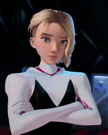
Lately I've also been noticing a lot of what we should probably call "the Gwen Stacy effect" where characters designers give female characters a pixie undercut and some piercings to make them seem edgy and "badass". It's not enough for me to not want to play a game but it's starting to feel lazy.

No Caption Provided
No Caption Provided
No Caption Provided
No Caption Provided

Avatar image for francium34
Francium34

447

Forum Posts

64

Wiki Points

0

Followers

Reviews: 8

User Lists: 0

#52  Edited By Francium34

I think I'm very open to most art styles, and then Nintendo's E3 presentation reminded me of danganronpa, which really repels any interest of playing them for me, for as much good stuff I heard about the series.

Avatar image for theonewhoplays
theonewhoplays

580

Forum Posts

0

Wiki Points

0

Followers

Reviews: 0

User Lists: 0

Binding of Isaac and BlazBlue are the first that come to mind.

Avatar image for constantk
constantk

232

Forum Posts

539

Wiki Points

0

Followers

Reviews: 0

User Lists: 0

I was really surprised to find I didn't like Sable in motion. In screenshots that game looks great. The combo of the flat shading and that low-frame-count animation style honestly made me a little queasy watching not-UPF last week. Not sure why.

Avatar image for peffy
peffy

177

Forum Posts

21

Wiki Points

0

Followers

Reviews: 0

User Lists: 0

One of the reasons I didn't gel with Dragon's Crown that much was the character design. I always play as a lady if possible, so I was forced to play as the Elf because the Amazon & Sorceress were so vomit-inducing to look at. .. and then there were the CGs throughout the game of oversexualized women. No thank you.

Another game that comes to mind is Nier on PS3. I didn't like the look of the main character, Kaine's costume is embarrassing, and I was really bored of fighting all those black/yellow monsters. I made it to ending #1 and could not get motivated to continue getting other endings. I also have yet to play Nier Automata, despite the praise it gets, because of my reaction to Nier.

In terms of "anime" style, I just generally hate loli designs. Characters that look like young girls but are wearing revealing outfits and/or are supposed to be much older than they look. (It's fine if the young girl is wearing something appropriate, but then, their personalities tend to be annoying as hell, too)

Avatar image for serryl
serryl

64

Forum Posts

0

Wiki Points

0

Followers

Reviews: 0

User Lists: 2

No Caption Provided

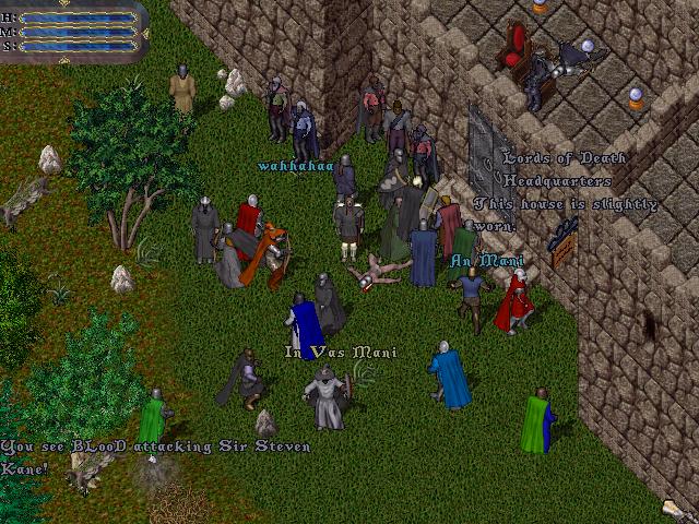
I'm normally willing to give any game a chance, but I do not like how Ultima Online looks.

The specific combination of an isometric view, realistic sprites, choppy animations, dithering effect, and flat lighting all turn me off.

It's the same reason I wasn't interested in the original Diablo or Baldur's Gate games when they came out.

Avatar image for pastry
pastry

43

Forum Posts

30

Wiki Points

0

Followers

Reviews: 0

User Lists: 1

Binding of Isaac for me too. I would probably play that game if it had any other kind of aesthetic.

Avatar image for hermes
hermes

3000

Forum Posts

81

Wiki Points

0

Followers

Reviews: 0

User Lists: 7

Yes, plenty of times.

More recently, I had only to see the bland look of Final Fantasy Origin to know I have no interest in ever playing it.

Avatar image for bonorbitz
BonOrbitz

2652

Forum Posts

1

Wiki Points

0

Followers

Reviews: 0

User Lists: 3

Almost every Final Fantasy after VI on the SNES. I miss the days when my imagination didn't have to deal with bad fashion, derivative anime hair and design, and/or rough 3D graphics.

Avatar image for efesell
Efesell

7509

Forum Posts

0

Wiki Points

0

Followers

Reviews: 0

User Lists: 0

@bonorbitz: Have you seen the art those sprites are based on though.

Avatar image for xinlum
Xinlum

3

Forum Posts

0

Wiki Points

0

Followers

Reviews: 0

User Lists: 0

While I really enjoyed the boss fights, the art in No More Heroes ultimately had me give the game up. The high contrast, while stylish, couldn't be given justice by the hardware and made parsing what was on screen actively draining to my eyes and brain.

Avatar image for eroq
Eroq

154

Forum Posts

0

Wiki Points

0

Followers

Reviews: 0

User Lists: 0

Never really had a strong negative reaction to a game’s look until that one David Jaffe game came out.

Yeah, came here to say this. Basically anything that tries really hard to hit that edgy and obnoxious aesthetic, usually for all the wrong reasons (thinking about things like Drawn to Death and Hatred specifically).

Avatar image for bonorbitz
BonOrbitz

2652

Forum Posts

1

Wiki Points

0

Followers

Reviews: 0

User Lists: 3

@efesell said:

@bonorbitz: Have you seen the art those sprites are based on though.

Yep... Still better and more beautiful than what we see today. Besides, it really doesn't matter because the sprites left much up to personal interpretation.

Avatar image for styx971
styx971

715

Forum Posts

10

Wiki Points

0

Followers

Reviews: 0

User Lists: 1

it doesn't happen often but yes. some retro styled indies with the longer bodies rub me the wrong way and some dated graphics do too. honestly the only thing i can think of off-hand bugging me tho to the point i wont play it is ff7 i know i would like everything about it but those arms are just ...no! they look like knock-off legos kinda. i've tried modding the pc version but it still just looks bad outside of battle. i didn't grow up with a ps1 tho so i'm gonna blame that but ff8 doesn't have that style and it looks great for its time , same with 9 honestly its just those arms in 7 -_-

Avatar image for liquiddragon
liquiddragon

4317

Forum Posts

978

Wiki Points

0

Followers

Reviews: 2

User Lists: 19

I think when Japan tries really hard to pander to a Western audience, it can look awful. Remember the game Quantum Theory? One of the most hideous games I think I’ve seen.

Avatar image for rob64
Rob64

1

Forum Posts

0

Wiki Points

0

Followers

Reviews: 0

User Lists: 0

The way Street Fighter & King Of Fighters look in their current iterations is awful to me. All the characters look like humongous roided out freaks with a tiny head stuck on top. It reminds me of the end of Beetlejuice where he had his head shrunk for trying to cut in line! (Mind you it would be perfect for a Final Fight reboot)

Also, Bloodstained: Ritual Of The Night. The 2.5D visuals just look really cheap to me. Hopefully the sequel ups the ante a bit.

Avatar image for coldwolven
Cold_Wolven

2583

Forum Posts

3

Wiki Points

0

Followers

Reviews: 0

User Lists: 0

Cell shaded games throughout the last few generations of console. It looked good during the PS2 era if only because cell shading could take advantage of the limitations of the tech with games like Sly Raccoon, Okami and XIII of the top of my head but now I just don't want to see it anymore.

Avatar image for infantpipoc
infantpipoc

711

Forum Posts

12

Wiki Points

0

Followers

Reviews: 49

User Lists: 25

Everything branded "A Hideo Kojima Game" so far...

Avatar image for infantpipoc
infantpipoc

711

Forum Posts

12

Wiki Points

0

Followers

Reviews: 49

User Lists: 25

I think when Japan tries really hard to pander to a Western audience, it can look awful. Remember the game Quantum Theory? One of the most hideous games I think I’ve seen.

Glad you brought it up and not me... It was Tecmo, right? Man, that's a weird one.

Avatar image for davidfox1983
davidfox1983

203

Forum Posts

0

Wiki Points

0

Followers

Reviews: 0

User Lists: 0

It's not quite the same thing but I've had my eye on "12 Minutes" for a while now. It seems to have been in development forever. I first saw it on a Quick Look Ex on Giant Bomb. All dialog was text only and here's how its "development art" looked at that point (this was in April 2015):

No Caption Provided

Jump forward to a few weeks ago and the game now has full voice acting and looks like this:

No Caption Provided

Source: Youtube: https://www.youtube.com/watch?v=TSTnOR6yDQw

I personally preferred the more simplistic look (even Jeff commented in the QL: EX that he enjoyed the aesthetic too). Additionally, the higher fidelity of the graphics have surfaced some ropey animations (check the Youtube video) and the voice acting has made some of the scenes where multiple characters are speaking at the same time feel a little clumsy as they talk over each other. This is an issue which inherently doesn't exist with text; we can be presented with multiple textboxes and still parse them. It can even add to the tension of a scene as we try to take in everything. A voice-based solution just sounds like noise. For an example, see around the 2:10 mark in this video ("Police.. don't move") and the lady's voice in the background.

I'm also interested in how the nature of 12 minute loops (you have a finite amount of time before everything resets) might work when I'm "managing" my time given that I can generally read text faster than I can listen to a spoken piece of audio.

I've gone on a bit of a tangent here but I feel it's somewhat related to the original question. The visual, animation and audio elements added to this game are turning me off it a little and potentially creating some problematic side effects that weren't there before. It's further annoying that adding all this stuff is probably one of the main reasons for the longer development lifecycle than I anticipated. It's been a long wait!

I guess I'll just have to wait and see...

Avatar image for tebbit
tebbit

4659

Forum Posts

861

Wiki Points

0

Followers

Reviews: 3

User Lists: 6

I really don't like the artwork from the Salt & Sanctuary folk. I know Jason loves these games , but i was sort of surprised to hear him call out how pretty their next game looked. I think i could sort of get on board with the gameplay at least, but don't know in which universe it can look pretty.

I'm with you on this one. I'm not a big Souls guy so the gameplay I could take or leave, but the visuals are a major turn-off for me. I think its the combination of the drab colour palette, cartoon art style, and the bloom that looks like someone smeared vasaline on the screen.

It reminds me of the bad old days of flash animation in the mid-2000s. I will say that Salt and Sacrifice has at least gone for a much prettier colour palette.

(I know the game was made by a tiny team. It's certainly impressive for what it is, just not my taste at all).

Avatar image for tebbit
tebbit

4659

Forum Posts

861

Wiki Points

0

Followers

Reviews: 3

User Lists: 6

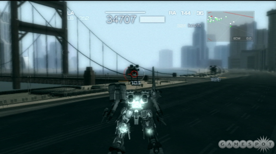
In a similar vein to my previous comment, I could not stand the art style of Armoured Core 4.

The Armoured Core series is a great example of graphics getting technically better, but artistically worse. AC1 was big, blocky, and relatively colourful (in an industrial way), with a really vivid UI.

Each subsequent game in the series became more detailed, rounder, and greyer. And with the advent of AC4, bloom was finally technically viable. There are approximately 4 colours used in AC4: grey, brown, blue-grey, and blue-brown. Everything is washed out, then blown out further by excessive bloom, and even the UI is muddy. I'll never understand why anyone thought this style looks good - I suspect the intended effect was "gritty and stark".

The PS3/360 generation is littered with similarly styled games, so I suspect at least some of this proliferation of ugliness was a result of technical limitations.

No Caption Provided

Avatar image for deckard
deckard

447

Forum Posts

4

Wiki Points

0

Followers

Reviews: 0

User Lists: 6

Im not a fine of most modern/contemporary 2D games’ art style. The “8-bit” and “16-bit” aesthetics are completely played out; on the other end of the spectrum I can’t stand the modern 2D pseudo-Flash/mobile game look.

Avatar image for giant_gamer
Giant_Gamer

1007

Forum Posts

0

Wiki Points

0

Followers

Reviews: 0

User Lists: 0

art style can be repelling or attractive to gamers no matter what anybody say.

a game that comes to mind when talking about art style and direction is Hatred that game was so bad in it art direction that failed eventhough they were trying to gain publicity over controversy.

Avatar image for undeadpool
Undeadpool

8424

Forum Posts

10761

Wiki Points

0

Followers

Reviews: 20

User Lists: 18

@laughingman: Agreed on both parts: I still LOVE old-school graphics when they're done well.

Avatar image for banefirelord
BaneFireLord

4035

Forum Posts

638

Wiki Points

0

Followers

Reviews: 0

User Lists: 6

Pretty sure I posted in here already, but two of the most recent Steam review darlings that on paper seem exactly like my kind of games I doubt I will ever play because of their aesthetics. Wildermyth’s proc-gen D&D campaign pitch sounds incredible, but that kind of rough pop-up book aesthetic looks terrible and makes me feel oddly claustrophobic. Likewise, I love im-sims and well-done satires, but Cruelty Squad almost literally makes me nauseous looking at it.

Avatar image for geirr
geirr

4166

Forum Posts

717

Wiki Points

0

Followers

Reviews: 1

User Lists: 5

I only play aesthetically-pleasing games. Whether it's 2D or 3D and ray-traced or whatever,
I need to enjoy looking at the thing I'm interacting with.

Avatar image for facelessvixen
FacelessVixen

4009

Forum Posts

0

Wiki Points

0

Followers

Reviews: 0

User Lists: 5

I don't like how the new Earth Defense Force looks.

Avatar image for laughingorc
laughingorc

58

Forum Posts

0

Wiki Points

0

Followers

Reviews: 0

User Lists: 0

The main recent ones for me are Street Fighter 4 / 5. I love fighting games, and I love games that have a distinctive art style, but I just cannot stand the weirdly exaggerated look of the characters in recent SF.

I'll echo the Salt & Sanctuary comments as well, and anything that looks flash-animated; if I want animated pixels, I want them to look hand-drawn, not like a character made from cut-together parts.

I'm also not big on modern NES-style pixel art. I know that may be sacrilegious to some, but give me 16-bit pixel art over 8-bit any day.

Avatar image for deactivated-647f76b346730
deactivated-647f76b346730

439

Forum Posts

0

Wiki Points

0

Followers

Reviews: 0

User Lists: 0

@pimpclops: no, I just have a different opinion. I truly detest the way that game looks.

Avatar image for noboners
noboners

751

Forum Posts

0

Wiki Points

0

Followers

Reviews: 0

User Lists: 0

@banefirelord: yeah I'm the same way with Wildermyth. On paper, it sounds very much like my jam. But I'm currently playing Paper Mario & the Origami King and Chicory, and I don't think I can handle any more paper cutout looking characters. (And I think Wildermyth is the least appealing out of those three aesthetics)..

Avatar image for bigsatch
bigsatch

7

Forum Posts

0

Wiki Points

0

Followers

Reviews: 0

User Lists: 0

I cant not play any game where the main character has a mustache and no beard. mustache AND beard is fine but for whatever reason i cant bring myself to play games like Curse of the Dead Gods because i find that look to be so abjectly repulsive. I dont know why i am like this.

Avatar image for colmymeh
Colmymeh

46

Forum Posts

0

Wiki Points

0

Followers

Reviews: 0

User Lists: 0

Prince of Persia Sands of Time 2: The EMO Angst and Swearing Years. Mainly because the original Sands of Time had such a strong art direction and a lovely framing device.

Avatar image for fjor
fjor

540

Forum Posts

9

Wiki Points

0

Followers

Reviews: 1

User Lists: 0

#89  Edited By fjor

@mttmcgrgr: yeah the gameplay in Hollow Knight is just what i like but the art looks horrible i would never play something that looks this way for more than 5 minutes

Avatar image for colmymeh
Colmymeh

46

Forum Posts

0

Wiki Points

0

Followers

Reviews: 0

User Lists: 0

As for Wind Waker, I loved it the moment I first saw it. I've always hated Twilight Princess as it struck me as a reaction/appeasement to the fucking assholes who wanted their video game about a magical fairy boy to be more "mature".

I love Wind Waker it's my favourite game/thing ever.

Avatar image for banefirelord
BaneFireLord

4035

Forum Posts

638

Wiki Points

0

Followers

Reviews: 0

User Lists: 6

@colmymeh: It’s not my favorite thing ever (though it is my favorite Zelda), but I also loved Wind Waker’s artstyle from the moment I set eyes on it. Would have loved to see another mainline Zelda in that style.

Avatar image for ashusp
AshuSP

62

Forum Posts

0

Wiki Points

0

Followers

Reviews: 0

User Lists: 1

Poorly done pixel art. There’s a lot of it out there. When its done right, it works but too often it just looks like the choice is made due to lacking a decent art vision/direction.

Avatar image for brendan
Brendan

9414

Forum Posts

533

Wiki Points

0

Followers

Reviews: 0

User Lists: 7

I wanted to try Bloodborne as my first souls game after all the positive GB chatter but I just don't like the gothic/horror vibe.

Avatar image for colmymeh
Colmymeh

46

Forum Posts

0

Wiki Points

0

Followers

Reviews: 0

User Lists: 0

@banefirelord:

And I think Nintendo themselves would love to do another mainline game with the same style.

Skyward Sword and Breath of The Wild both have a little bit of the Wind Waker's art style in them.

Avatar image for onemanarmyy
Onemanarmyy

6406

Forum Posts

432

Wiki Points

0

Followers

Reviews: 2

User Lists: 0

#98  Edited By Onemanarmyy
Avatar image for deactivated-647f76b346730
deactivated-647f76b346730

439

Forum Posts

0

Wiki Points

0

Followers

Reviews: 0

User Lists: 0

@pimpclops: I cannot, other than the tactics game they announced from the same folks, which of course would be similar.

Avatar image for constantk
constantk

232

Forum Posts

539

Wiki Points

0

Followers

Reviews: 0

User Lists: 0

One that was a big bummer for me was Sable. I loved looking at pre-release screenshots and looked forward to it's release. The problem is when it's in motion, something in my eyes/brain just can't handle it and I get a bit nauseated. Into the Spiderverse does the same thing to me, which is another thing I wish I could enjoy more.